CSS Button Generator
It is a high-performance automatic button generation tool that allows you to create buttons intuitively.
Background color, background gradation, button shadow (box-shadow), character shadow (text-shadow), size (width, height), border (border), rounded corners (border-radius), It corresponds to transition (animation) etc.
Since it also supports pseudo elements (before, after), mouse hover (hover), and pseudo elements after mouse hover, it is possible to generate buttons with various designs.
20 types of samples We have the above!
Sample list. Select the one that most closely matches the image of what you want to make. It is possible to edit after selecting.
- ボタンWith hover animation
- ボタンWith hover animation
- ボタンWith hover animation
- ボタンWith hover animation
- ボタンWith hover animation
- ボタンWith hover animation
- ボタン
- ボタン
- ボタンWith hover animation
- ボタン
- ボタン
- ボタンWith hover animation
- ボタンWith hover animation
- ボタンWith hover animation
- ボタンWith hover animation
- With hover animation
- ボタンWith hover animation
- ボタンWith hover animation
- ボタンWith hover animation
- ボタンWith hover animation
- With hover animation
- ボタンWith hover animation
.original-button { display: flex; align-items: center; justify-content: center; line-height: 1; text-decoration: none; color: #ffffff; font-size: 18px; border-radius: 5px; width: 200px; height: 40px; font-weight: bold; transition: 0.3s;}
.original-button:hover { opacity: .7;}How to use the tool
・I don't know how to use the tool.
・I want to know various ways to use it
・I want to know the details of each item
For those who like, we have prepared a video that introduces the contents and features and explains how to use it.
Please take advantage of it.
Lots more videos on Website!
List of generators
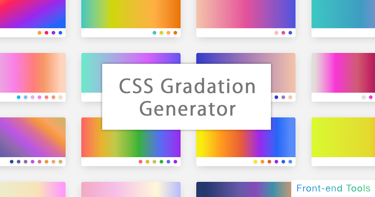
CSS Gradation Generator
It is a generator for applying a gradation to the background.
It supports linear-gradient, radial-gradient (circular), conic-gradient (fan shape), etc. of basic (linear) gradation, and can generate gradation intuitively.
Since it also supports the specification of multiple gradations, it is also possible to generate a color that mixes multiple gradations by making the specified color of the above gradation transparent.
In the circular / fan-shaped gradation, in addition to preparing a tool for intuitively operating the center position, it is also equipped with a function that can intuitively operate the angle (deg) of the linear / fan-shaped gradation. I am.
It also supports repeated gradations.
You can also select and customize from over 70 types of samples!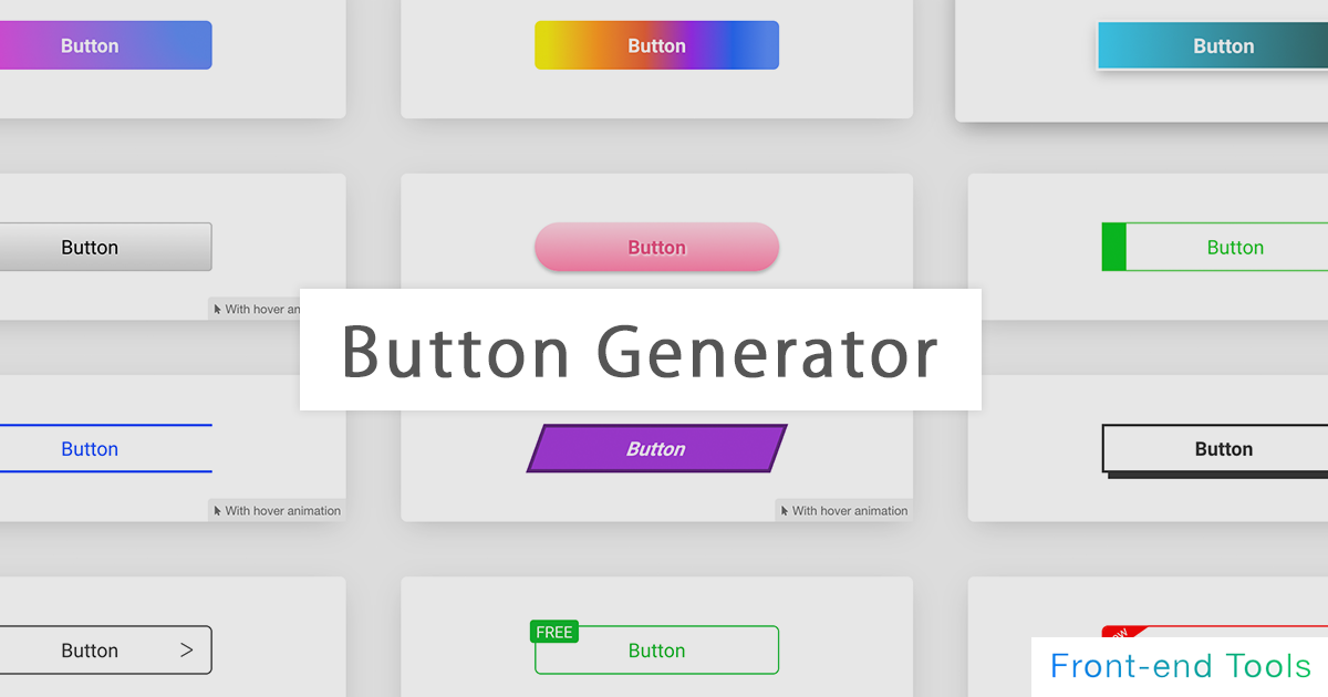
CSS Button Generator
It is a high-performance automatic button generation tool that allows you to create buttons intuitively.
Background color, background gradation, button shadow (box-shadow), character shadow (text-shadow), size (width, height), border (border), rounded corners (border-radius), It corresponds to transition (animation) etc.
Since it also supports pseudo elements (before, after), mouse hover (hover), and pseudo elements after mouse hover, it is possible to generate buttons with various designs.
20 types of samples We have the above!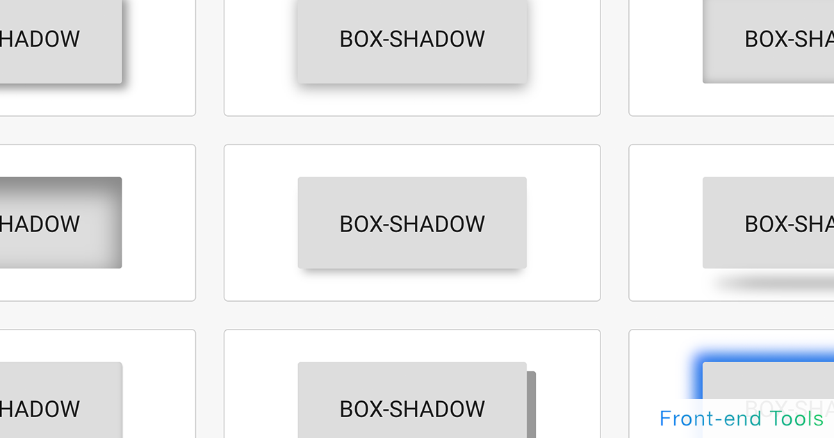
CSS Box Shadow Generator
A box-shadow tool that allows you to add shadows to images and elements.
You can choose from a wealth of samples and customize them.
It also supports the generation of inner shadows (inset) and multiple shadows. It also supports pseudo-elements such as before and after.
Pneumophysism samples are also available.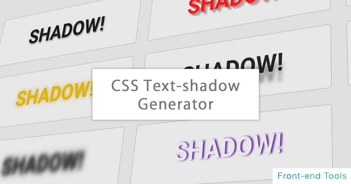
CSS Text Shadow Generator
It is an automatic text-shadow generation tool that can add various shadows to characters.
You can choose from a wealth of samples and customize them.
You can try various designs by supporting real-time text changes and multiple shadows.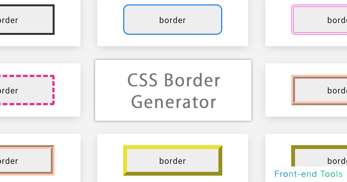
CSS Border Generator
It is a CSS automatic generation tool for adding a border.
In addition to being able to specify up, down, left and right individually, you can also generate dotted lines, dashed lines, double lines, and three-dimensional lines (groove / ridge / isnet / outset). increase. You can also specify the preview size (width / height) and rounded corners (border-radius)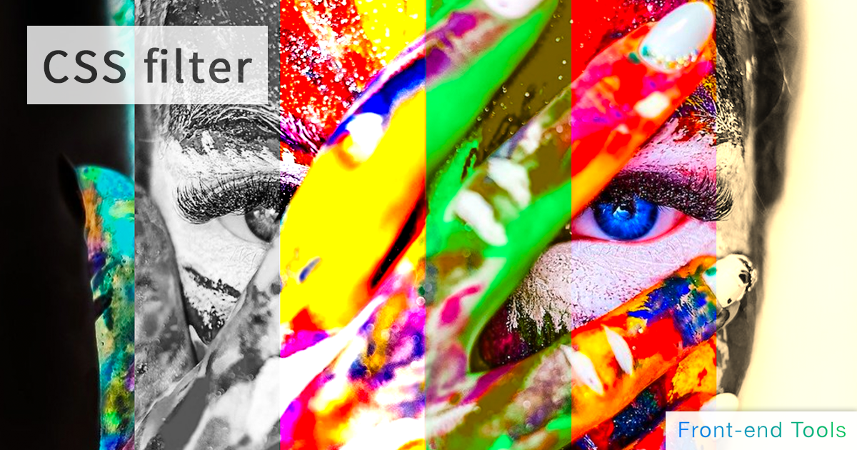
CSS Filter Generator
A css filter tool that makes it easy to implement effects on images and elements.
Blur, brightness, contrast, grayscale, hue-rotate, invert, saturation, sepia, shadow. You can specify multiple (drop-shadow) and so on.
For those who do not know how to use it, we have prepared a sample of css filter
Also, you can switch between multiple sample images and HTML elements as a preview, and upload your own image temporarily. You can also preview it!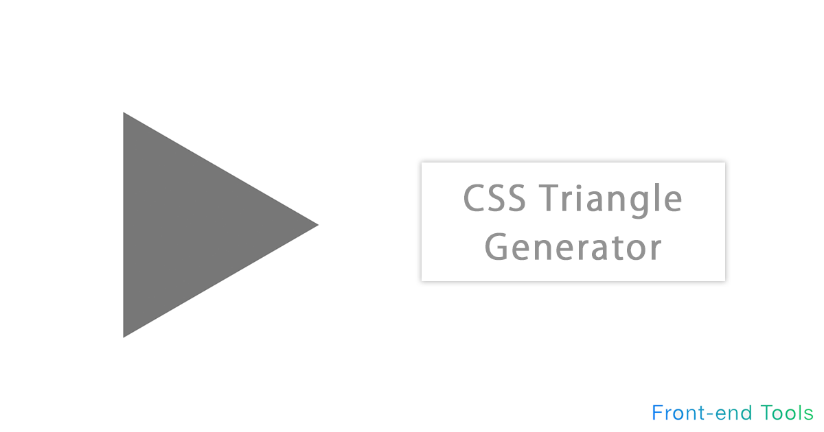
CSS Triangle & Arrow Generator
It is a generator to create a triangle with only HTML and CSS.
Arrows are automatically generated by using CSS border. All directions of 360 degrees can be specified other than up, down, left and right
In addition to being equipped with a function for automatically calculating equilateral triangles, the colors can be changed freely.
Please use it for balloons and flowcharts.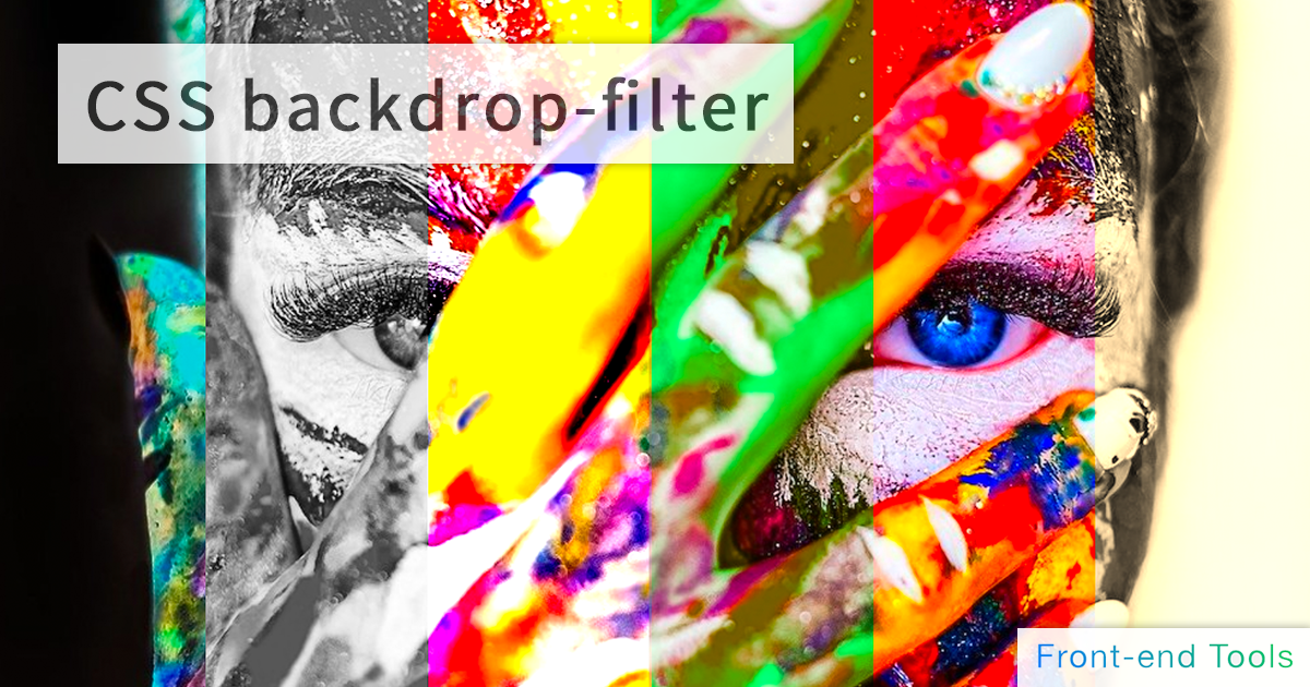
CSS Backdrop-filter Generator
A back drop-filter tool that allows you to implement an effect behind a specified element.
Blur, brightness, contrast, grayscale, hue-rotate, invert, saturation, sepia, shadow. You can specify multiple (drop-shadow) and so on.
For those who do not know how to use it, we have prepared a sample of css filter
Also, you can switch between multiple sample images and HTML elements as a preview, and upload your own image temporarily. You can also preview it!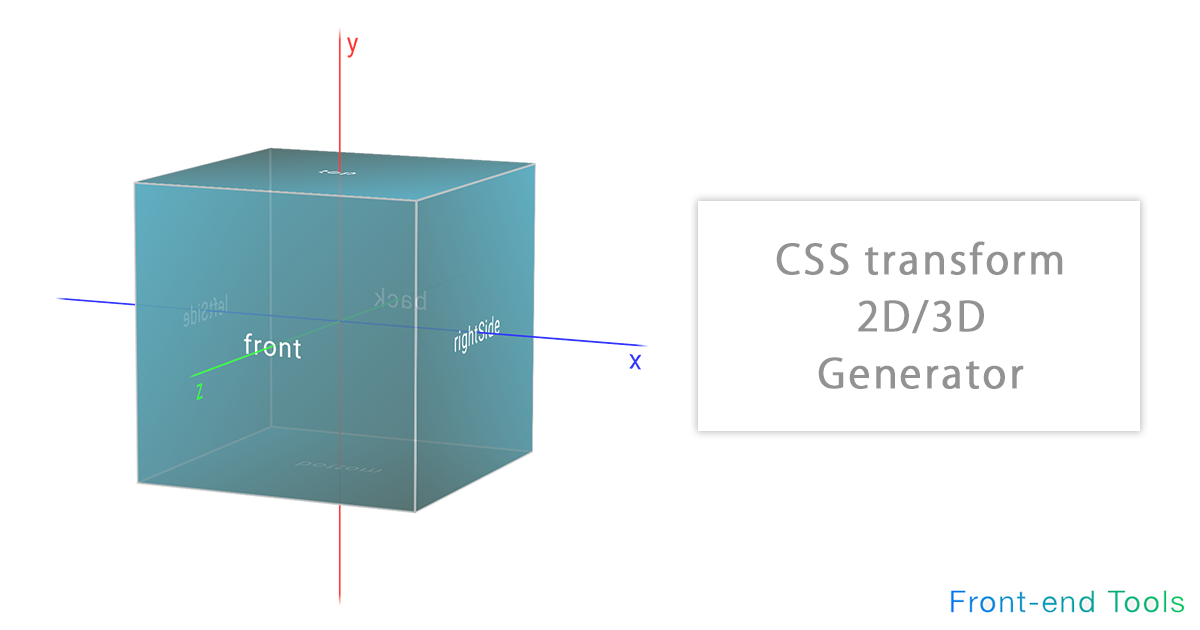
CSS Transform 2D/3D Generator
It is a tool for simulating the execution result of trasnsform with intuitive operation.
Translate (move), rotate, scale (enlargement / reduction), skew (distortion) can be intuitively operated in 2D / 3D direction. It also supports transform-origin (rotation axis), perspective (perspective / viewpoint), perspective-origin (vanishing point).
In addition, the target element and the original X, Y, Z axes can be visually displayed.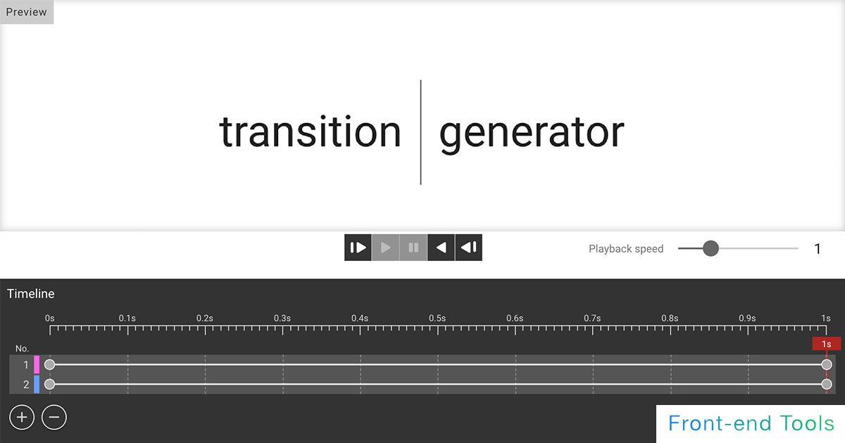
CSS Transition Generator
A transition generator for simple animations.
Supports easing, duration, delay, etc. You can select from the samples and edit them. You can finely set the style before and after the animation, so you can use it as a simulation of transition.
You can also change the reverse playback and playback speed of the animation. You can also stop in the middle or simulate the state of the element at any elapsed time.
CSS Animation & Keyframes Generator
A tool for CSS animations. Supports easing, duration, delay, etc.
List of other Tools
Description of each CSS property
- box-shadow
- The box-shadow property allows you to set a shadow on an element.Each value can be specified as follows
box-shadow: Shadow inward(inset)amount of horizontal displacementamount of vertical displacementamount of shadow blurringshadow sizeshadow color- Negative values foramount of horizontal displacementamount of vertical displacementwill place them vertically above and horizontally to the left, respectively.
- A positive value forshadow sizemakes it larger, while a negative value makes it smaller.
Example description) box-shadow: inset 2px 2px 3px 4px #000;If inset is not required, the description is also unnecessary.- If only two values are specified, they are set asamount of horizontal displacementamount of vertical displacement
- If only three values are specified, an additional third value is set asamount of shadow blurring
- If only four values are specified, an additional fourth value is set asshadow size
The initial value forshadow coloris currentColor (the value set for color).If border-radius is specified, the shadow will also reflect that rounding.If border-radius is specified, the shadow will also reflect that rounding.
To specify multiple shadows, separate them with a comma ",". The first shadow specified will be in the foreground.
Example description) box-shadow: inset 2px 2px 3px 4px rgba(0, 0, 0, .5), 0px 0px 3px #ff0;Use text-shadow to add shadows to text. - border
- The border property allows you to set a border (element boundary) on an element.Each value (value) can be specified as follows
border: border widthborder typeborder color
Example description) border: 1px solid #333
Incidentally, the order of the values does not matter; the initial value of border is none.Each value can also be specified individually, for example- border-width
- border-style
- border-color
Example description) border-width: 10px;
Example description) border-style: solid;Each of these can also be oriented.
Example of border-width- border-top-width
- border-right-width
- border-bottom-width
- border-left-width
- border-top-style
- border-right-style
- border-bottom-style
- border-left-style
- border-top-color
- border-right-color
- border-bottom-color
- border-left-color
In addition to solid, the following values can be specified for border-style.- double. Two straight lines (double lines) are displayed and the total width is the px size specified in border-width.
- groove. It is displayed as a three-dimensional depressed line.It is the reverse of ridge.
- ridge.It appears as a three-dimensional raised line, the opposite of groove.
- inset. The top and left lines will appear darker, the bottom and right lines will appear lighter, and the entire image will appear as if it is three-dimensionally depressed. This is the opposite of outset.
- outset. The top and left lines will appear lighter, while the bottom and right lines will appear darker, giving the appearance of three-dimensional ridges. The opposite is true of inset.
- dashed. Displays a dashed line. Displays a series of dashes or line segments with short, square corners.
- dotted. It is displayed as a dotted line. Specifically, it displays a series of round dots. The radius of the dots is half of the calculated border-width of the same edge.
You can also define the direction in which the border is to be specified.- border-top
- border-bottom
- border-right
- border-left
- border-radius
- The border-radius property allows you to round the corners of an element.
Setting one radius results in circular corners; setting two radiuses results in elliptical corners.The value can be specified in units of px, em, %, etc. and can be specified as follows
Example description) border-radius: 5px;
Initial value is 0.Each of the four locations (upper left, upper right, lower right, and lower left) can also be specified with the following properties- border-top-left-radius
- border-top-right-radius
- border-bottom-right-radius
- border-bottom-left-radius
- before / after
- before and after create pseudo-elements as children of an element.
The before is created as the first child element of the element and the after as the last child element of the element.
Also, the content property is required.
When describing "before," a ":" (colon) is placed in front of it.
However, to distinguish it from pseudo-classes, it is often described with two colons.
Example description)
.test::before {
content: "";
}In addition to strings, quotation marks, counters, images, etc. can be inserted in the content property.
Since it is generated as an inline element, it must be converted to a block element when specifying a size such as width.Since screen readers may not be able to access pseudo-elements, it is necessary to consider whether pseudo-elements should be used for information that is necessary for users. - hover
- hover allows the user to specify the behavior of the cursor (mouse pointer) when it hovers (passes over) an element.
Example description)
.test:hover {
color: red;
}If you want to animate the animation, specify the transition property to the selector before the animation, so that the animation will occur when hovering and when the hover is released.
Example description)
.test {
transition: .3s;
}
.test:hover {
color: red;
}Note that on devices such as smartphones, hover takes the form of firing at the moment of a tap, which appears to be buggy.
They often consider utilizing media queries and user agents. - text-shadow
- The text-shadow property allows you to set a shadow on a character (text).Each value (value) can be specified as follows.
text-shadow: horizontal displacementvertical displacementshadow blur amountshadow color
Example description) text-shadow: 2px 2px 3px rgba(0, 0, 0, .5)Negative values forhorizontal displacementvertical displacementwill place it vertically above and horizontally to the left, respectively.
The initial values forhorizontal displacementvertical displacementshadow blur amountamount are 0 for each.
Ifshadow coloris not specified, the color selected by the user agent will be used. Therefore, it must be explicitly defined for cross-browser compatibility.Multiple shadows can be specified.
To specify multiple shadows, separate them with a comma ",". The first shadow specified will be in the foreground.
Example description) text-shadow: 2px 2px 3px rgba(0, 0, 0, .5), 0px 0px 3px #ff0; - transform
- The transform property allows an element to be transformed.
There are four main values for transform that can be specified.- translate
- rotate
- scale
- skew
Example description) transform: scale(1.1) skew(10deg);
The default value is none.
If multiple elements are specified, they are applied to the elements in the order in which they are specified.Values other than skew can be specified in the X, Y, and Z axis directions (3D). skew can only be specified in the X and Y axis directions.
For example, to specify only the X axis for translate, the following can be specified.
Example description) transform: translateX(10px);Each designation can also be specified as follows
translate- translate(X-axis travel distance, Y-axis travel distance)
- translateX(X-axis travel distance)
- translateY(Y-axis travel distance)
- translateZ(Z-axis travel distance)
- translate3d(X-axis travel distance, Y-axis travel distance, Z-axis travel distance)
- scale(Scale ratio in X-axis direction, Scale ratio in Y-axis direction)
- scaleX(Scale ratio in X-axis direction)
- scaleY(Scale ratio in Y-axis direction)
- scaleZ(Scale ratio in Z-axis direction)
- scale3d(Scale ratio in X-axis direction, Scale ratio in Y-axis direction, Scale ratio in Z-axis direction)
- rotate(Angle of rotation)
- rotate3d(Rotation angle about the X axis, Rotation angle about the Y axis, Rotation angle about the Z axis, Angle of rotation)
- rotateX(Rotation angle about the X axis)
- rotateY(Rotation angle about the Y axis)
- rotateZ(Rotation angle about Z-axis)
- skew(Inclination angle of X axis, Inclination angle of Y axis)
- skewX(Inclination angle of X axis)
- skewY(Inclination angle of Y axis)
- position
- The position property sets how the element is positioned.
The top, right, bottom, and left properties determine the position of the placed element if a value other than static (the default value) is specified.
For non-static values, the z-index (order of overlap) can be specified. z-index defaults to auto. A numerical value can be specified, and the higher the value, the higher the element will be displayed as the upper layer (the layer in front).The position property can be set to the following values- relative:The position of the element itself does not change even if it is specified, but unlike static (default value), it is affected if top, etc., is specified.
- absolute:If an ancestor element is specified other than static, it is placed with respect to the nearest specified ancestor element.
- fixed:The elements are positioned relative to the screen.
The position does not change when scrolling. - sticky:Like fixed, it fixes the position when scrolled, but it cannot leave the scope of the parent element.
- gradation
- There are three major gradient methods in CSS that can be used to express gradients.
You can specify the background basically anywhere you can specify a background.
Gradients are generated by the browser, so they look better when enlarged and can be resized on the fly. Specifically, there are three.- linear-gradient
It represents a gradient on a straight line. Primarily, multiple color transit points can be specified between 0% ~ 100%, and the angle of the gradient can also be specified.
The following can be specified: linear-gradient(gradient angle or direction, starting color, color on the Way (via), end color)
The angle or direction of the gradient is not required, but can be specified as an angle, such as 60deg (where deg stands for degree), or as text, such as to top, to right, to bottom, to left, etc. The default value is 180deg (the same as specifying to bottom).
The color on the Way (via)can be omitted. If intermediate colors are specified, the starting position of each color can also be specified by separating each color with a single space, if necessary.
Example description) background-image: linear-gradient(150deg, rgba(247, 166, 12, 1) 10%, rgba(255, 34, 87, 1) 50%, rgba(35, 102, 247, 1) 90%); - radial-gradient
Like linear-gradient, multiple color transit points can be specified between 0% and 100%.
The following can be specified: radial-gradient(Ellipse or Circle position from start to end of gradient at center position, start color, color on the Way (via), end color);
You can also select acircle or ellipsewith the default value of ellipse.
The position from the start to the endof the gradation can be specified from four options: closest-side, farthest-side, closest-corner, and farthest-corner, with farthest-corner being the default value.
center position (initial position where the gradient starts) can be omitted if the initial value is the top, bottom, left or right center of the element (X: 50%, Y: 50%).
As with linear-gradient, the color on the Way (via) can be omitted, and if necessary, the starting position of each color can be specified by separating each color with a half-width space.
Example description) background-image: radial-gradient(circle farthest-side at 17% 89%, rgba(247, 166, 12, 1) 10%, rgba(255, 34, 87, 1) 50%, rgba(35, 102, 247, 1) 90%); - conic-gradient
It represents a gradient in the form of a fan. Primarily, you can specify multiple color transit points between 0 ~ 360deg (degree. angle), and you can also specify the starting angle of the gradient.
The following can be specified: conic-gradient(from gradient start angle at center position, start color, color on the Way (via), end color)
The starting angle of the gradientis optional and its default value is 0deg.
The center position, like radial-gradient, can be omitted with the initial values being the top, bottom, left, right, and center of the element (X: 50%, Y: 50%).
As with linear-gradient, the intermediate (via) color can be omitted, and if necessary, the starting position of each color can be specified by separating each color with a half-width space.
Example description) background-image: conic-gradient(from 15deg at 26% 30%, rgba(247, 166, 12, 1) 36deg, rgba(255, 34, 87, 1) 180deg, rgba(35, 102, 247, 1) 324deg);
Although it is often mistakenly specified in the background-color property, it is specified in the background-image property.
Example description) background-image: linear-gradient(red, blue);You can also specify a repeating gradient with the repeating-linear-gradient, repeating-radial-gradient, and repeating-conic-gradient properties.These gradients can be specified in multiple layers, separated by commas ",". The first gradient specified will be the top gradient (layer); be careful not to increase transparency by rgba or other means, otherwise the gradient below will not be visible.
The first one specified will be the highest and the last one will be the lowest.
Example description) background: linear-gradient(217deg, rgba(255,0,0,.8), rgba(255,0,0,0) 70.71%), linear-gradient(127deg, rgba(0,255,0,.8), rgba(0,255,0,0) 70.71%), linear-gradient(336deg, rgba(0,0,255,.8), rgba(0,0,255,0) 70.71%);
Excerpted fromMDN Web Docs - linear-gradient
- color
- When specifying colors on the Web, "HEX," "RGB," and "HSL" are often used.First of all, HEX, which you see most often (hexadecimal number), is a way of expressing colors in hexadecimal. It is expressed in the form of #1234ab.
The six digits after # are the values of red (1st~2nd digits), green (3rd~4th digits), and blue (5th~6th digits). Various colors are represented according to the color intensity of each value.
If each of the two digits is the same value, a three-digit expression can be used. For example, #aa9933 can be represented as #a93.
If you want to specify the transparency in hexadecimal, you can use an 8-digit number, with the 7th to 8th digits also in hexadecimal. 80% transparency can be specified with #aa9933CC, for example.RGB, like HEX, is capable of representing colors in red, green, and blue.
Each value can be specified in the range 0 ~ 255 and is represented as rgb(red value, green value, blue value).
Example description) rgb(10, 50, 220)
If you want to specify transparency, you can use rgba(red value, green value, blue value, transparency(alpha)).
The alpha value can be specified in the range 0~1, for example rgba(0, 0, 255, .5).HSL stands for Hue, Saturation, and Lightness.
When specifying colors in HSL, colors are specified using these three elements. Once the hue (type and shade of color) is determined, colors can be determined by adjusting saturation and lightness, which is more intuitive than RGB.
The following can be specified: hsl(hue, saturation, lightness)- Hue:Basically, you can specify a number between 0 and 360. If you specify a number beyond this range, it will be considered as a circumference, so for example, if you specify 380, it will be the same as 20.
- Lightness:You can specify a value between 0 and 100%; the closer to 100%, the brighter the image. Conversely, the closer the value is to 0%, the darker it becomes.
alpha values can be specified from 0 to 1, for example, hsla(80, 80%, 50%, .5).